Showing posts with label color theory. Show all posts

Thursday, January 13, 2011

Hup, Two, Three, Four - Daily painting #8

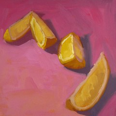
"Hup, Two, Three, Four" 6x6 Original Oil Painting on Canvas click here to Purchase

In keeping with the anti-rain and gray skies, I had some more fun with lemons today. These guys are looking a bit disorganized,but give them a couple more seconds and they will fall into line.

I really love all these colors together. After looking at it closer, I realized this was a split complimentary scheme. This is often a very pleasing color scheme for a viewer. The primary and most pure color os a yellow/yellow orange. I then used a red violet and a blue violet in less saturated hues. The blue violet was the color that I desaturated the most, as it is the most dissimilar from yellow. By using the split complements rather than the true complement, violet, the piece is more harmonious. You have to be careful with a straight complimentary scheme. Putting two completely opposite colors together can be really jarring to the viewer.

- Posted from my iPad

Monday, November 8, 2010

The Jetlag and Rainy Season Blues...


This is this week's homework.  I had a ton of fun with the oranges, although because the rainy season started, I'm finding that it takes a massive amount of discipline to get through the day, much less paint.  Thank goodness that I have a schedule.  Otherwise I think I would curl up in bed for three months.  Gray days do not get along with me!

I have about three more paintings to post, so you are in luck!  I have finally recovered from massive jetlag (four day turnaround across 24 time zones does NOT do a body good...).  New Orleans was a ton of fun, fall weather was just kicking in, so it was in the 70s (I totally miss that!) with low humidity and blue, blue skies... Still, it is good to be back and see Joe.  He's my buddy.  Okay, off to my artist in residency!

Thursday, October 21, 2010

Birthday Wrap-up, 100 Painting Evaluation


I figured I would wrap up my birthday on a high note.  Just in a couple months I am astounded at how much I have learned, how much I am finally understanding and getting.  I am so excited at how much I have improved so far, but then I am totally humbled by how much I still have to learn.  I've completed 65 (ish) paintings out of the 100 for my goal, but I also realized that in those 100 days, I was counting weekends.  Silly Shelby!

In any case, this painting got me a B+ with just a couple suggestions to be able to take it to an A.  I swear, I have never worked so hard for grades before.  Kind of funny that throughout all of my schooling, and all of the good grades I got, I never had to work as hard as I do for art.  Who would have thought painting and drawing was so technical and scientific?

I love birthdays.  I've always loved them, and my parents did a wonderful job of making sure my birthday was always special.  My husband continued the tradition this year, and I couldn't be more thankful.  I'm surrounded by wonderful friends (all over the globe!) and family.  This support network is not only allowing, but cheering on my pursuit of my dreams.  It is terrifying when you realize you are the only one that is getting in the way of your happiness; truly, once you are in the real world, the only thing standing in between you and what you want to do, is you.  Well, you and your choices.  Granted, if we were back in the US, pursuing my MFA would be much more difficult.  But I was still working on painting in the US, and receiving tremendous support, and even seeing a little success.  There is always a way, if you are willing to make the choices and changes to get there.  So thank you everyone for the support.  It means the world to me, and I am working as hard as I possibly can to be worthy of it.

Thursday, October 7, 2010

Project 1 - Final


Here is the final 50% of my first project.  In the week and a half since I painted the first 50%, I have learned so much already.  I was very pleased that I was able to carry that into the final part of this painting.   My professor is spectacular, and the other students are intelligent and helpful with all of their critiques.  I love this learning process.  Their biggest critiques about my first submission (shown below) was that the perspective was off on the pitcher's ellipse and the handle needed to be adjusted.  I had also made the shadows in the lemon too cool.  

I feel like I really made a huge leap in color this week.  If you look at these two steps of the same painting, I think I can illustrate how.  Look at the fruit.  In the first versions, the color is just off.  Granted, we were really only supposed to show three values, but the apple is kind of dull, the lemon has a shadow that is too harsh and it doesn't look rounded, and the orange is not only too yellow, but the shadow is too blue.  They are just all off.  

In order to fix the fruit, I used colors close to the local color, rather than jumping straight to the object's complimentary color.   For example, for the lemon, as it goes into the shadow, I used a dull red as the object starts turning away from the light, and then used a tiny dab of blue.  Before I had mixed up a violet from ultramarine and alizarin, which can be pretty intense, and as you see below, overpower the yellow.  


In other notes, I don't think I will be finished with my cityscape this week.  I am learning so much, including how slowly oil dries when you are doing multiple layers!

Monday, October 4, 2010

Still Life Mania


Here is this week's assignment.  I am working on finishing up the project I talked about last week, and I'm also working on a larger cityscape, so I should have some more things to post this week.  With this painting I really tried to get back to basics and work with color.  This was the first week we were really allowed to use a full palette, which is pretty intimidating when you first try to tackle it.  My critiques about colors were such that I really wanted to stop for a moment and really focus on how colors turn through space.  Basically I had been making the shadows on the objects too harsh, too cool.  So my professor was giving some great tips on how to get the object to turn through space.  

For example, on a red object, say it is bright red, like the apple on the right.  You almost never use bright red straight out of the tube.  Rather, as the apple turns towards the light, you will use some yellow, since the light source is yellow.  You can't use white exclusively, or your apple will turn pink.  So I used a combination of a lighter red paint, cadmium yellow, yellow ochre and a touch of white.  Then as the apple turns away from the light, the shadow will get cooler than the red of the apple.  Because it is a warm colored object, cooler also means that it will be slightly grayer (not as saturated).  To accomplish this, I used some of the cadmium red light, mixed with alizarin crimson (a very bluish red) and a small touch of viridian (cool green).  

I've been having the most problem with yellows.  I was making them entirely too harsh on the shadow side.  In the end, I found a great mixture winds up being a dull yellow from Tera Rosa, Cadmium Yellow Light, Yellow Ochre and a smaaaall touch of Ultramarine.  If you just combine cadmium yellow light and violet (ultramarine and alizarin crimson) it can get too cool too quickly.  You almost have to combine the yellow with a red violet to get (more alizarin than ultramarine) in order to get a good shadow.  

I'm working really hard at mixing colors by using the colors next to each other on the color wheel, so they don't turn muddy.  So much thought and science goes into this.  Who would have thought?
Monday, July 19, 2010

Mind Contortions in Color Theory

Well lovely, I just lost a post. Love it. Color theory is giving me a headache. I submitted a couple of my color block studies to be critiqued, and I realized I did them completely wrong. There was a whole section of knowledge that I *sort of* knew, but didn't have perfected. Now that I've gone back and found that information and spent the better part of 4 hours reading and processing it, I spent the afternoon working on fixing it and really getting a grasp on it. It is going to continue to take a while, but I think I am on my way at least. Here are two blocks I did in overcast conditions. The light was really coming from the side, not the top because it came through a window and it was indirect, overcast conditions.


Related Posts with Thumbnails