Monday, January 31, 2011

Old School - Daily Painting #16

"Old School" 6x6 Oil on Panel Daily Painting click here to Purchase

I was starting to feel in a bit of a rut thanks to monsoon season.  Not rain, but monsoon season.  It started raining Friday night and hasn't stopped all day today (it is Monday afternoon).  That gets me down after a while.  Thankfully, Daily Paintworks had a challenge up.  I was hoping someone would start another challenge group after Karin Jurick's "Different Strokes" blog kind of petered out.  I would have, but I don't have quite the following that she does.   In any case, I found this challenge to be tons of fun, and quite a challenge.  All of the reflections!  The hardest part was not looking at what other people had submitted so far.  That was tough.

In other news, school starts today, and I am very stoked.  I was never this excited about business school in undergrad.  Maybe it's a sign?  This semester is Cityscape, so I'll be wandering the city, taking my paints with me!  Oh, I can't wait.

Friday, January 28, 2011

Hot n Chili - Daily Painting #16

"Hot n Chili" 6x6 Original Daily Painting click here to Purchase
This painting involved a lot of experimenting with gray.  I kept coming up with purple every time I combined Alizarin and Viridian (dark red and dark green).  Usually, these two colors are supposed to yield a nice deep black, but I just got purple.  They probably both leaned too far towards blue to do a good job of making a black.  So instead I tried cadmium red and viridian.  I got this beautiful gray to work with.  Just love it!

Thursday, January 27, 2011

Kiwi Cup - Daily Painting #15

"Kiwi Cup" 6x6 Oil on Panel click here to Purchase
I am almost back into the swing of things.  After going to Taipei, I had a two day training for Photoshop and Adobe InDesign.  A fantastic course, if I must say, but I'm definitely glad not to be cooped up on a classroom at the moment!  This was the last one of the kiwis.

Tuesday, January 25, 2011

Strike a Pose - Daily Painting #14

"Strike a Pose" 6x6 Oil on Panel, click here to purchase
As I was painting these kiwi slices, I just kept imagining these models, turning this way and that for the camera.  The kiwis started to take on a personality of their own, and before I knew it, visions of Zoolander were running through my head.  I'm off to Taipei, Taiwan tonight to see a childhood friend I haven't seen since 1996.  It should be exciting!  I promise to post to the Dillon Factor Mom!

Thursday, January 20, 2011

Vain Kiwi - Daily Painting #13

"Vain Kiwi" 6x6 Oil on Panel Daily Painting click here to purchase
This week is definitely Kiwi week.  These two look remind me a bit of the shoving matches my brother and I used to have as kids to look in the mirror when we were kids.  Never mind the fact that neither of us could really see into the mirror, or that you don't need to see yourself brush your teeth, we each HAD to stand in front of the mirror.  One of those small sibling rivalries.

Wednesday, January 19, 2011

Kiwi Glow - Daily Painting #12

"Kiwi Glow" 6x6 Original Oil Painting on Canvas click here to Purchase
I was in the grocery store earlier in the week and saw some Kiwi fruit from Italy.  Kiwi fruit - from Italy!  In the middle of winter!  I was completely amused by it.  Once I set these guys up, the light was shining through them in a really neat way that made them glow.  Being able to paint Kiwis reminds me of beach, and summer.  I miss the Lowcountry!

Tuesday, January 18, 2011

Ivory Tower - Daily Painting #11

"Ivory Tower" 6x6 Original Oil Painting on Canvas click here to Purchase

Doesn't the coffee mug look quite the smug one, looking down from its tower of peons? I really enjoyed painting all of the reflected colors from the background. Between the incandescent light and the background, these objects were anything but white.

On another note, I think I figured out my photography problem. The side patio where I was taking the photographs is surrounded by white buildings. Well, this creates some horrendous reflected light, even in places I thought were shaded! Kind of crazy. So I took the advice of Layne Cook, (who has a fantastic daioypainting blog of her own), set my ISO to 200, the white balance to cloudy, with vibrant color. Then I parked myself on the back side of the building, which is completely in shadow, and viola! Better pictures. Much less glare and color correction needed. Finding that completely shaded spot was key. I'll probably put up a tutorial on how to do this later in the week once I get my (formerly dead) computer back up and running.


- Posted from my iPad

Monday, January 17, 2011

Glass Stacks - Daily Painting #10

"Glass Stacks" 6x6 Original Oil Painting on Canvas click here to Purchase

Glass bowls stacked on a reflective surface, oh my! This was definitely a challenge, and it took me a few tries to get it right.

It has been kind of a rough weekend, to say the least, so I found getting back into the studio today a welcome distraction. On a good note, I was able to catch up with a friend that is pretty tough to track down. The hubby's and I are going to Italy in March for two weeks, so I was trying to figure out dates to see the friend. I'm going to be taking my paints and new pochade box with me; it just arrived this week. Painting plein air is going to be interesting!

- Posted from my iPad

Friday, January 14, 2011

Critique Friday

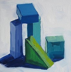
I was very intrigued by this painting, "Moving On," by Carol Carmichael. It is just so vibrant and colorful. It also has a very interesting composition. So, I decided to try and dissect it a bit to figure out why it works, why it is so eye catching.


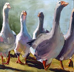
I do this quite a bit, analyze others' work. If you take it apart, you can start to understand why it works, and use these insights in your own artwork to strengthen it. So, without further ado, here is some of what I found (the lines might not be totally straight, I apologize).


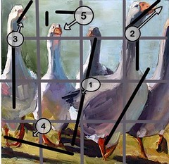
1. This is where my eye initially catches in the painting. Carol has put the lightest value in the painting right next to the darkest value, creating a strong contrast thar will attract the eye. She also did a good job of not placing it directly in the center. A lot of teachers would recommend putting it further down and gurner to the left or right, but it works here because of the secondary focal point (#5), which is mire in the spot that the rule of thirds recommends.

2. Rather than have the viewer's eye get stuck from such a centralized focal point, my eye is drawn up the swan's body, to the head, end of the beak,and out of the painting. This is good. You want your viewer's eye to move around the painting, so they don't get bored.

3. Although my eye is moved out of the painting with #2, it is brought back in with the angle of the head and the light hitting the swan's head on the far left. My eye then moves down the body again, to the feet, where it hits:

4. The shadows. These shadows are a powerful feature of this painting. The strong lighting is reinforced by the shadows, and they continue to create a very pleasing rhythm. Imagine if the light were coming from the other direction - none of the forms would be defined nearly as well, and most of the ground shadows would be lost in the feet! Carol picked the perfect lighting angle for this piece.

5. After the ground shadows, my eye heads to the central swan, which thankfully is in the back. Otherwise, if he were in front, he would take up too much attention because of being in the center, and the composition would not be as successful. The angle of his head then leads my eye to the secondary (and much more interesting) focal point.

Ack! I haven't even touched the wonderful interaction between colors, but this composition just absolutely intrigued me. The viewer's eye is lead around, so they don't become bored, but it is not so complex as to be confusing. Great job, all great decisions.

- Posted from my iPad

Thursday, January 13, 2011

Hup, Two, Three, Four - Daily painting #8

"Hup, Two, Three, Four" 6x6 Original Oil Painting on Canvas click here to Purchase

In keeping with the anti-rain and gray skies, I had some more fun with lemons today. These guys are looking a bit disorganized,but give them a couple more seconds and they will fall into line.

I really love all these colors together. After looking at it closer, I realized this was a split complimentary scheme. This is often a very pleasing color scheme for a viewer. The primary and most pure color os a yellow/yellow orange. I then used a red violet and a blue violet in less saturated hues. The blue violet was the color that I desaturated the most, as it is the most dissimilar from yellow. By using the split complements rather than the true complement, violet, the piece is more harmonious. You have to be careful with a straight complimentary scheme. Putting two completely opposite colors together can be really jarring to the viewer.

- Posted from my iPad

Wednesday, January 12, 2011

Sunshine and Lemons #8

"Sunshine and Lemons" 6x6 Original Oil Painting on Canvas click here to Purchase

Ungh. Rainy season. This girl can only take so many gray, rainy days before she starts getting a little stir crazy. To combat against the blues, i decided to have a bright, happy yellow daily painting today. Freshly sliced lemons on a beautiful mustard yellow foreground.

I'm amazed at how interesting it is to work with different colors. I find it tough to believe how much orange is in a lemons and how much yellow is in an orange when you are painting it. When you actually stop and look at the real color, not just the one that you mind labels it, you start seeing such a wonderful world of color.


- Posted from my iPad

Tuesday, January 11, 2011

Pear Up #7

"Pear Up" 6x6 Original Oil Painting on Canvas click here to Purchase

You don't want to be the last one picked! Make sure you find a buddy - it reminds me of grade school field trips.

Lost my blog post again. Brilliant. I also lost my computer. Hard drive died, and I hadn't backed anything up in a year. So, I've learned my lesson - back your stuff up!

In other news, I spent a lot of today working through quick study exercises. I think it really helped me let go - I timed each of these little studies (they were only 4x4), used a big brush, and focused on staying loose. He are the results. Kind of crazy how differently each one looks!


- Posted from my iPad

Sunday, January 9, 2011

Hello Down Below! #6


I think this was my favorite one from this week's exercises. It looks a bit like the two oranges in the bowl are shouting down greetings to the other oranges. Kind of fun and light hearted. I also was finally getting the colors better now. I've been trying to get that teal cloth accurate, but it was eluding me. On the lit side I kept using Naples yellow or yellow ochre, which made it kind of a dirty color. When I tried a bit of cadmium yellow light, viola! Now it is a really pretty sea foam green (very technical, I know).

Next week I am going to follow the example of Layne Cook and focus more on simple. I get so jealous of here brushwork. This week has been a great re-entry into doing art, but I need to focus on my brushwork and not overworking it. Sigh. Always more to learn!

Speaking of which, I'm having a lot of problems photographing my work correctly, and it is really bugging me. I'm not sure if the blue shadows are picking up the glare for a special reason, but in almost every picture I've taken of my work, one part or another is blown out and has glare. Grrrrr. Any thoughts?


- Posted from my iPad

Thursday, January 6, 2011

Last One In #5


It looks like all the oranges are piling into the bowl as fast as possible, and last one in is a rotten egg! Working on loose brushwork, and my oranges and blues and grays. Starting to feel more comfortable again, thank goodness.

- Posted from my iPad

Wednesday, January 5, 2011

Tell Me My Future #4


As I was painting these two guys, they seemed like they were looking in to the jigger trying to see their future. Although, if I were them, this might denote being juiced for a drink in the near future!

- Posted from my iPad

Tuesday, January 4, 2011

Back to basics #2 and 3


Well, that was nice. My app just lost this post I was typing up. Sigh.

Needless to say, I was very frustrated on Monday when I painted for five hours and the only thing I had to show for it was three wipe-offs. Nothing was flowing. My brushes felt odd in my hand, I couldn't get colors to work, it was a mess. But I showed up on Tuesday determined, and i pushed through. It still took a couple of tries, but I finally feel like I am in a groove again. This was the first attempt, but I liked the colors of the final product (above) much better.


- Posted from my iPad

Monday, January 3, 2011

Dappled Light - 1


I've had a really difficult time getting in a groove. This little guy was my third attempt at painting today. The first two were total wipe-offs. I'm hoping to get the bad stuff out of the way so I can make some good breakthroughs.

- Posted from my iPad

Sunday, January 2, 2011

Looking towards 2011

I've spent quite a lot of time thinking about what I want to accomplish this year. 2010 was such an amazing year for me - I started working on my MFA and I can see how much my art has improved in just one short year.


This was one of the first paintings I posted to this blog. Pretty colors, okay drawing, but lots of room for improvement. And below is my final project in Still Life. Night and day difference and improvement. Still, I want to get back to the above style more and loosen up a bit. My work has gotten a little tight for my taste ;).


In any case, last year was another kind of reactionary year, which irked me. Since mid 2008, life has been totally crazy (all in good ways!), but as a result, I've lost some really good habits that I want to find again. So, as a result, here are some things I would like to do this year (in no particular order):


  1. Sketch every day (see www.lizsteel.com for inspiration!)
  2. Paint at least five small paintings per week
  3. Start developing a more painterly style
  4. Exercise regularly
  5. Start a Singapore cityscape series
  6. Write more handwritten letters
  7. Eat in more
  8. Eat healthier
  9. Call a friend once a week and catch up
  10. Visit 5 new places this year (I have tickets booked for Taiwan and I am hoping Beijing in May!)
  11. Get outside to paint!
  12. Get over my fear of painting/sketching something good every time. I need to get used to not worrying about messing up.
  13. Stop reading so much news, it is depressing and eats up too much time. Instead, focus on other artist blogs for insight and inspiration (www.makingamark.com gave me the idea for this blog post, as well as some other fabulous ideas on other artists to follow.)


Okay, thats it for now. I have so much running through my head right now, but I think I'm going to close with something I heard another person say in conversation one night.  It is edited (slightly) for language, but honestly, I think this is going to be my mantra for 2011:

"Forget contentment.  There is no better feeling than doing something difficult, something on the edge of your abilities, and then succeeding."  - Anonymous  

Here is to a challenging and fulfilling 2011!
- Posted from my iPad
Related Posts with Thumbnails