 |
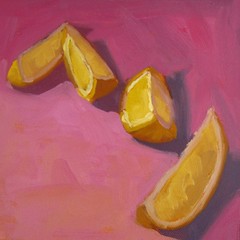
| "Hup, Two, Three, Four" 6x6 Original Oil Painting on Canvas click here to Purchase |
In keeping with the anti-rain and gray skies, I had some more fun with lemons today. These guys are looking a bit disorganized,but give them a couple more seconds and they will fall into line.
I really love all these colors together. After looking at it closer, I realized this was a split complimentary scheme. This is often a very pleasing color scheme for a viewer. The primary and most pure color os a yellow/yellow orange. I then used a red violet and a blue violet in less saturated hues. The blue violet was the color that I desaturated the most, as it is the most dissimilar from yellow. By using the split complements rather than the true complement, violet, the piece is more harmonious. You have to be careful with a straight complimentary scheme. Putting two completely opposite colors together can be really jarring to the viewer.
- Posted from my iPad

No comments:
Post a Comment